Banana Joe Games Visual Code
This is the graphic direction of Banana Joe Games as it stands on 11 October 2026. It holds what every graphic shares, the rules drawn from Andrea Deotto's notes, and a library of every layout built so far, each with the files that rebuild it. It rests on the first feed of 5 October (36 graphics, 33 of them at five stars), on 49 recreations of pins he rated, made over four steps, of which he has voted on the first three (34 recreations, 28 at five stars), and on seven fair brochure pages. Where a sentence is his own it is quoted. Everything else is a reading of his votes, and section 7 lists what he has not decided yet.
Before you design or change any graphic for Banana Joe Games, read the Visual Code on the production Drive:
_CORE/BJ - Branding/BJ - BR - Identity/BJ - BR - ID - Visual Code.md
Pick a layout from its library (the cards are in BJ - BR - ID - Visual Code Recipes.md beside it, with pictures at https://bjg-hub.web.app/visual-code.html), follow its rules, and show me the result beside the layout it follows.
Words used here
- The first feed is the 36 graphics and six question pairs made for the Instagram feed and voted on 5 October. Their ids begin with a and q.
- A pin is one reference picture from the boards Andrea collected and rated with stars, numbered BS- on the Bombshell board and BJ- on the studio board.
- A recreation is a graphic that rebuilds one pin with our own material. Its id begins with r, and a letter after the number (r14b) marks the same layout with other content.
- A layout is the arrangement a graphic follows, and a recipe is the written card for one layout.
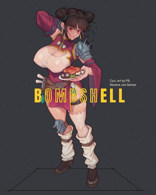
- A tile is a feed graphic of 1080 x 1350 px. A master is the editable Illustrator file of a graphic.
- A step is one batch of recreations shown to him for a vote. There have been four, after a round 2 that he turned down.
- The marker
[tiles: …]at the end of a rule lists the graphics that show it.
1How to use it
A session that has been pointed here reads sections 2 and 3 whole, then chooses a layout in section 4. The file is long, so a reader that stops part of the way through reads on from where it stopped: sections 5 to 7 hold the tools, the checks before posting and what is still open. The order of work never changes, because the two failures he has named most often, a subject that did not suit its layout and a graphic blended from several references, both came from skipping its first steps.
- Fix the content first: which game, which subject, which true words. The words come from the sources in section 5 and are never written fresh.
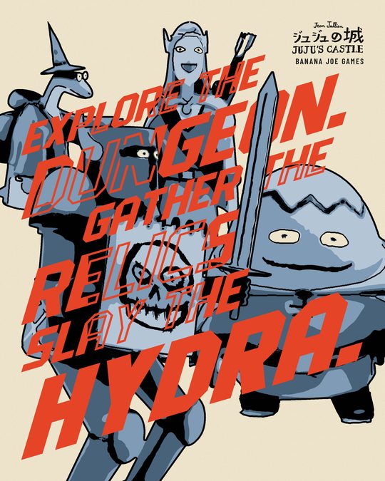
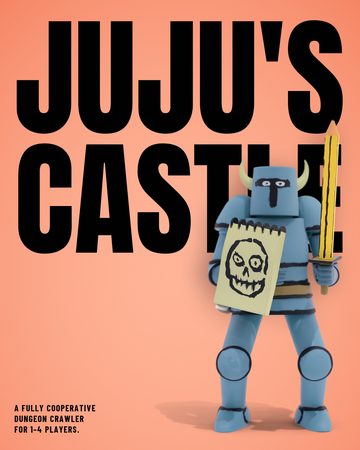
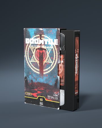
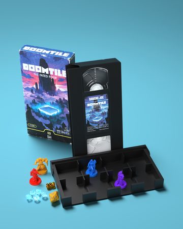
- Search the library and the first feed for that subject. If the graphic already exists, say so and ask whether he wants it as it is, with new words, or as a new take. The four heroes of JUJU's Castle under one tagline are r14c, and a DOOMTILE sleeve on lit teal is a21.
- Choose the layout whose subject is of the same kind as yours. The index in section 4 says what subject each layout needs, and its recipe says what it takes and how to make a new one.
- Copy the layout's complete working folder,
~/Code/bjg-feed-work/round3/<id>/, to a new folder outside the Drive and build there, because every build script writes beside itself and would overwrite the approved picture. A first-feed layout is copied from…/BJ - MK - Feed Proposal/BJ - MK - FP - Sources/<id>/in the same way. - Show the result to Andrea beside the layout or the pin it follows, on a voting page of the hub (section 5 has the command), and read his stars and his note before touching it again.
- After his vote, save the picture under its stable name, build the Illustrator master for what he keeps, add the graphic to the Library and run the builder, so that this document and the recipes stay true.
When no layout fits the content, the new graphic starts from one pin he rated four or five stars and follows it part for part, as rules 2 to 4 say. His stars on all 637 pins are on the hub page pin-boards and in …/BJ - MK - Feed Round 3/BJ - MK - R3 - his votes on the pins.json, and the pin pictures are in ~/Downloads/ideox_bombshell and ~/Downloads/ideox_banana-joe-production. Once he has voted on the result, it enters the library as a new recipe.
2What every graphic shares
A Banana Joe Games graphic shows either a real object lit on a single hue with one soft shadow on the floor, or a flat poster of a cut-out character or of lettering on one flat ground, with a hard shadow, the banana halftone and a light grain. Titles are in Anton and everything else in Barlow, the studio is named once and small, and every graphic is rebuilt part for part from one layout of the library or one pin he rated.
One language covers the studio and all its games. Andrea set that on 6 October, after a round that had sorted looks by game:
"It is important not to divide by category. Fine that games must have their own language, but right now we are creating a GLOBAL Banana Joe graphic language, as we did with the first feed, where there was a mix and all of them worked more or less. I understand each game's language, but that comes later."
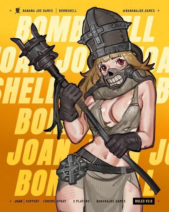
A reference and this section each decide different things. The reference decides the composition, the proportions, the density and the way the lettering is built. This section decides what stays ours whatever the reference does: the colour values, the two typefaces, the surface and how the studio is named. On the pin behind r01 he wrote "not the colours", and that tile took five stars on a ground of our own.
The work so far falls into two families, and a new graphic belongs to one of them before anything else is decided. The split is a reading of his votes, since the first feed and the recreations were made in two different ways and both took five stars.
| Lit object | Flat poster | |
|---|---|---|
| What it shows | A real thing: a box, a cassette, a card, a toy, a miniature, photographed or rendered | A character or a word: a cut-out illustration, a sculpt printed in flat inks, lettering |
| Ground | One hue from edge to edge, lighter in a pool behind the object and darker at the corners | One flat ground: a loud colour, a cream page or ground black |
| Shadow | One soft shadow on the floor | The subject's own outline moved sideways, flat, with no blur |
| Where it comes from | The first feed, and r26 and r28 among the recreations | Most recreations, and the first feed's posters, labels and type tiles |
| Look at | a21 a31 a34 r26 r28 | r01 r03 r14 r27 r30 |
Formats
- A feed tile is 1080 x 1350 px in sRGB. Added lettering keeps 60 px from every edge because the profile grid trims a post at the sides, and the tile has to read when it is shown 432 px wide.
- No set type goes under 22 px. Hand lettering that follows a pin went down to 16 px on r12 and still took five stars.
- Nothing ends at the frame by accident. An element stops inside the margin, or it clearly runs off the page by 40 px or more.
- A fair brochure page is 844 x 1804 px and is built at double size.
Colour
Each loud colour has a shade, a darker tone of the same hue that draws its halftone, its hard shadow and its floor.
| Colour | Value | Job |
|---|---|---|
| Banana yellow | #FFCD2D | The studio's colour. On a graphic with no reference behind it, yellow does one job only: a flat ground under black type, the title ink on a dark or loud ground, or a chip. Where a reference uses its yellow in several jobs, ours follows it (r21). |
| Ink black | #010101 | Type, outlines and chips on yellow and on loud colours. It is the black of the logo. |
| Ground black | #17150F | Dark pages, bands and bars, type on cream, and every hard shadow that is black in its reference. |
| Paper cream | #EDE3CB | Paper: a page, a margin, a printed sheet, and lettering that a reference prints in cream. |
| White | #FFFFFF | The hard graphic white of a reference: on a flat saturated colour, as a panel or a letter face on black or beside cream (r16, r23, r27), as the page itself where the reference is a white page (r12), and as the die-cut border of a sticker. |
| Pure black | #000000 | The black stage under a printed object that is lit on every edge. |
| Magenta | #E2017A | A loud flat ground. Its shade is #A8005A. |
| Red | #E64426 | A loud flat ground and the ink of slanted lettering. Its shade is #C93A1F. |
| Orange | #F39401 | A loud colour and the shade of banana yellow: it draws yellow's halftone, offsets and rims. Its own shade is #C76F00. |
| Cobalt | #3478F9 | A loud flat ground. Its shade is #1F4FC0. |
| Teal | #1798A3 | A loud flat ground, and the pool of the default lit ground under an object. Its shade and corner colour is #0B545C. |
| Light blue | #6FC9E1 | A loud flat ground. Its shade is #2E93AD. |
| Plum | #742576 | The wall of the clay render and the last band of the stripe ramp. |
| Dark grey | #38393E | The one neutral dark page under a figure. |
A flat poster takes one ground, the anchors (yellow, cream, the blacks) and at most one more loud colour. A lit object takes one hue between a pool and a corner, drawn by ground2.py, and teal is the default because teal and blue scored best under objects in his votes.
Each game brought colours of its own through its art, such as Bombshell's pink #FF2E6E or Hunger Chain's greens #5B9E2E and #9AD13F. While the one language is being built, none of them is reserved to its game, so r13 could put a JUJU's Castle toy on a lime that starts at #9AD13F, with #5B9E2E as its darker tone.
Type
- Anton sets titles, names and large numerals, in capitals except where a statement is set in sentence case (a04, still open in section 7). It never sets running text and it stays sparse.
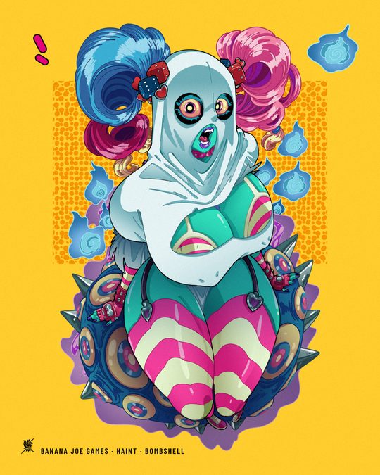
- Barlow sets everything else. Barlow Condensed in capitals sets chips (Bold, 24 px, in a box 44 px high with a 3 px outline and 14 px of side padding), credits and the small line. The small line is one line of capitals near the foot of a tile, such as BANANA JOE GAMES · HAINT · BOMBSHELL on r15 (SemiBold, 26 px, tracking 0.12 em). Sentences are Barlow Medium at 22 to 26 px.
- Drawn lettering takes over wherever the reference draws by hand the word that carries its picture, as rule 9 says.
- The font files are in
_CORE/BJ - Assets/BJ - AS - Fonts/(BJ - AS - FN - Anton,BJ - AS - FN - Barlow). Older build scripts read Anton from~/Code/bjg-demo-reel/assets/fonts/Anton.ttfand Barlow from the Mac's Fonts folder.
Surface
- The banana halftone is the studio's own dot screen, made of the spots of the logo's banana. It appears as two tones of one ground, as a field or inside a figure. The ready Fade files are placed at one fixed scale per format (1417 x 850 px on a feed tile, 666.7 x 400 px on a brochure page) and are never stretched to fit a field.
- A print grain of about 1.2% lies over the finished picture on most recreations and on the flat fields only on a few (r01, r02, r13, r17). r12, r22 and r34 carry none. In the master it is a locked top layer.
- A cut-out figure or a block of lettering takes a hard flat shadow. A photograph or a render keeps one soft floor shadow.
The studio's name
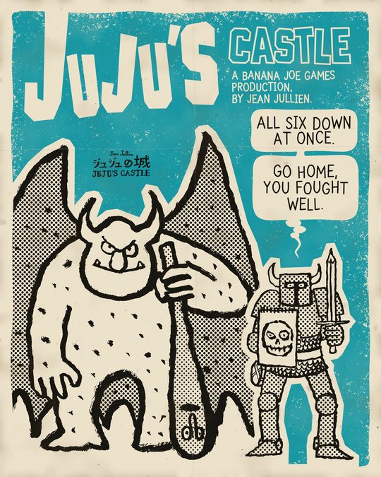
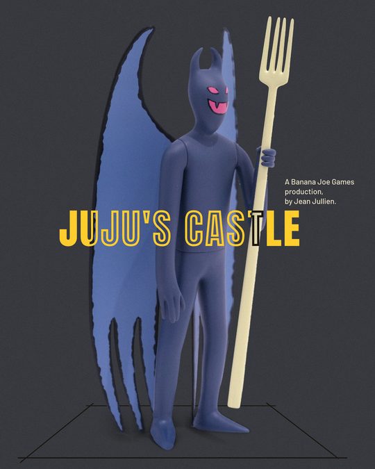
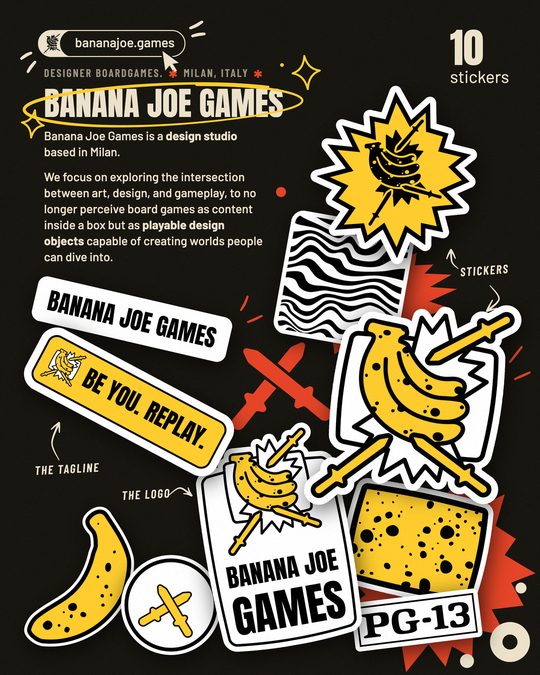
Every graphic names the studio once, small, and five forms have passed his vote: the one-colour icon alone (r21), the icon with a small line (r22, r23), a small line alone (r24, r25, r26), the icon in a black square (r27), and a credit sentence, which on r28 reads A BANANA JOE GAMES PRODUCTION, BY JEAN JULLIEN. The name is written Banana Joe Games in full in everything public, and the tagline is Be You. Replay. with its two full stops.
3The rules
These rules come from his notes on round 2 and on the first three steps of recreations, translated closely in BJ - MK - R3 - what_andrea_said.md. Each one names the graphics that taught it or show it, except rules 4 and 22. Among those graphics r33, r34 and r35 are examples he has not voted on yet. The numbers stay fixed so that a session can cite a rule.
Where a graphic starts
- 1
One language serves the studio and every game. No look is reserved for one game and none is kept off the studio's own graphics while this language is being built. A language for each game comes later, on his word.
- 2
A graphic starts from one reference, never from a blend. It follows one layout of the library or one pin he rated, in composition, proportions, density and the way its lettering is built. Graphics blended from several pins were the round that disappointed him, with nine of its 26 marked "not this", and he answered it with: "I would go step by step and RECREATE precisely some of the graphics, instead of blending them at random."
- 3
A graphic stays as close to its reference as our own material allows. The recreations that followed their pin part for part took five stars. One that took the parts and missed how they were drawn read to him as "the poor copy", so frames keep the reference's angles (r11), outlines keep its weight (r16, r19) and lettering keeps its perspective (r08).
- 4
He judges each graphic beside the reference it follows. A new graphic goes on a voting page of the hub next to its reference, and his stars and his note decide the next move.
The subject
- 5
A layout takes only a subject of the kind its reference shows. A layout built on a living, moving character needs one of our characters with that pose and energy. A miniature on its base, a box, or a character with another attitude in that role is "the wrong subject". It cost r16 and r17 their first versions (three and two stars) and held r06b and r06c at four and three, while r06 took five with a toy he was unsure of. If no subject fits a layout, the content takes another layout.
- 6
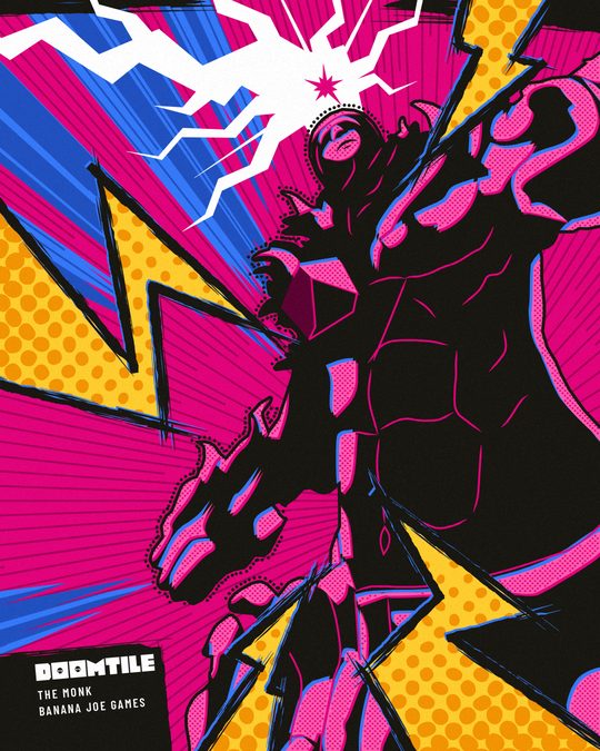
At phone size the figure reads at a glance. A viewer can tell who the figure is and find its head and face, even when the figure is printed in dark inks. Of r25 he wrote that "the subject is unclear".
- 7
A prop is the real object, never another object reshaped to pass for it. A stretched video cassette standing in for a guitar was one reason r17 took two stars the first time.
Lettering
- 8
Anton sets titles and Barlow sets everything else. Section 2 gives the sizes.
- 9
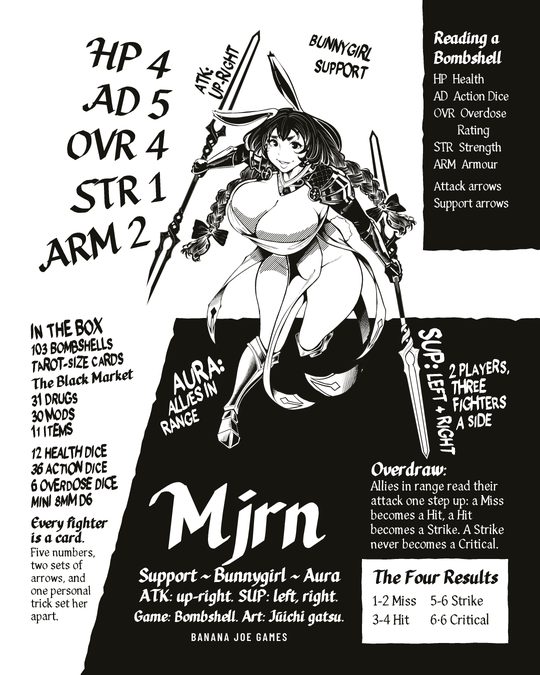
Lettering follows the manner of its reference. A word the reference draws by hand, and that carries the picture, is drawn for our graphic with our own letterforms: the VS of r08, the tag of r27. A page lettered by hand throughout stays hand-lettered, since set type made r12 "very, very different". A reference set in type is set in Anton and Barlow.
- 10
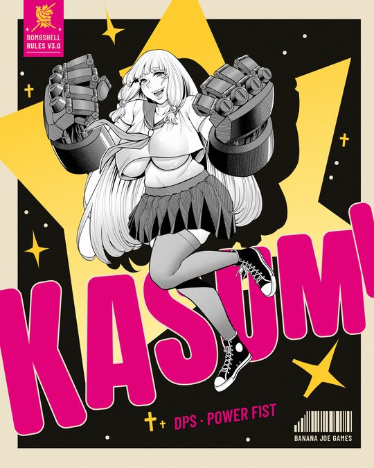
A title that passes behind a figure is one whole word on one layer. The letters keep even spacing and the figure hides whichever of them fall behind it. No gap is opened for the figure, because splitting Kasumi's name round her was the one thing that kept r03 from five stars the first time.
- 11
Names sit where the reference puts them and keep its perspective. That holds when a wide pin is carried into a tall tile, and names that grow toward the outer edges keep growing.
- 12
No dashed rule goes under a word. A row of dashes reads to him as a cut-off line of writing, and he said so twice.
Shapes, effects and extras
- 13
Every shape has a reason he can see at once. A shadow reads as the shadow of the thing that casts it, or it is left out. A black slab behind r06's toy read to him as "a random black shape".
- 14
An effect reads as what it is and sits where something happens. Lightning is drawn as bolts and a burst marks an impact. Where an effect meets the centre of a composition it is drawn in full, because on r08 he found it strange that "the central point almost disappears instead of being a well-made bolt". Sparkles and bolts scattered over a picture read as random.
- 15
Small extras belong to the subject or stay out. In r07's pin the small objects round the character were two drones, its own gear, whereas the Bombshell logos we put in their place "have nothing to do with it". A piece cut out of a painting and set flying looks like a cut-out, and of flying extras with no job he said: "the flying elements are useless".
- 16
Where the reference has an abstract graphic, ours is an abstract graphic of the same kind, drawn for the graphic. The studio's logo never stands in for it.
Colour and surface
- 17
A flat poster has one flat ground, which is a loud colour, a cream page or ground black. On a loud colour, the shade of that ground draws its halftone and its shadow.
- 18
White is white on colour, and cream is paper. Where the reference has a hard graphic white on a flat saturated colour, ours is #FFFFFF: "it should be a clean white". Cream stays for pages, margins and printed sheets, unless the reference is a white page, as r12's is.
- 19
The surface of a graphic is built from the banana halftone, the print grain and hard shadows. The halftone stays in two tones of one ground and never dissolves its subject, and heavy grit such as photocopy noise or eroded letters stays out.
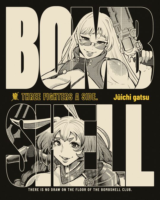
Frames and housings
- 20
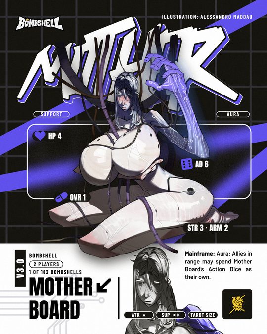
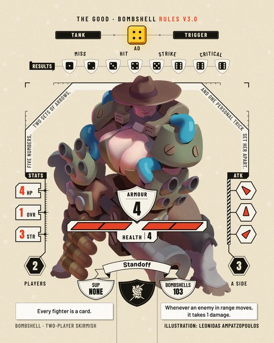
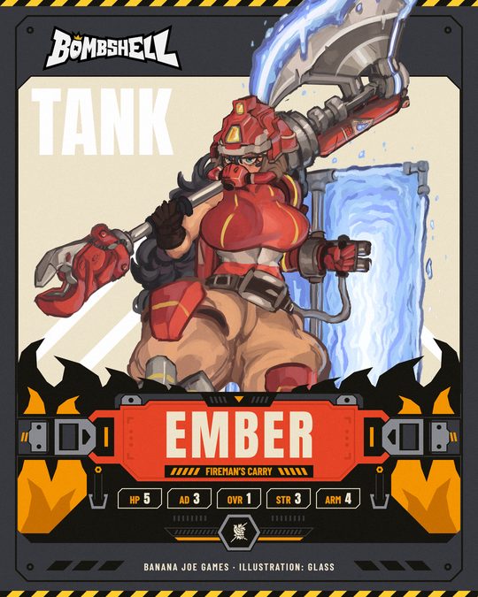
A frame never looks generic, ornamental or made by a machine. Of r29's first version he said: "They are very AI and a bit too fantasy. The direction is beautiful, but I would do a more cyberpunk take." A housing, meaning the plates, tags and brackets that hold a page's numbers and labels, is therefore built for Bombshell material from straight edges, chamfers, tick rows, segments and plain labels, as on r35 and on the frame, health bar and arrow cells of the repaired r29. Both wait for his vote, and r29 keeps its ribbon and shields from the voted version. r27's rounded glass frame and pills took five stars as plain interface parts.
The studio, the words and reuse
- 21
The studio is named once, small. Section 2 lists the forms that passed.
- 22
Every word is true. Card names, numbers and skill text come from the card reader on the day, a game's facts come from the Copy Bank, and each illustration names its artist in the exact string the artist chose. Everything public is in English. A poster has carried the artist's credit in its caption (r01), while sheets and comic pages have printed it on the graphic (r12, r27, r30); which of the two is the rule is still his to say.
- 23
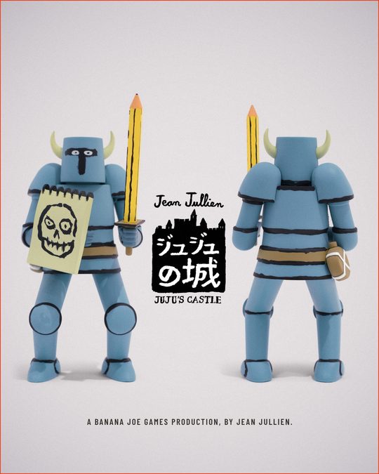
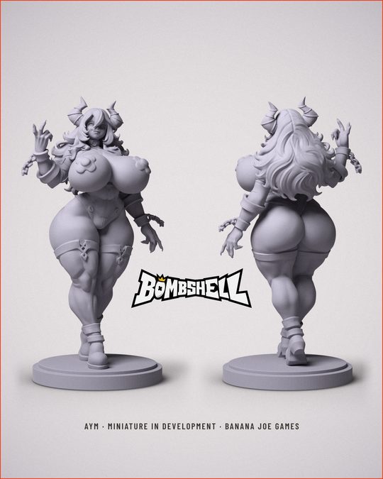
How a graphic is built
- 24
A graphic is built with its reference's own means, never approximated to save time. A graphic on a library layout is made by that layout's own scripts with new content, and a graphic on a pin is a full recreation of it. Six SPIEL carousels sketched in quick code on 18 October dropped whole paintings where r18 has cut-out figures and set type where it draws its words, and he set them beside r18: "Quello sopra era una replica esatta e bella, quelli sotto fanno schifo." Nothing reaches him before a critic who did not build it has compared it with its reference at full size, and when time is short fewer graphics are made, each one properly.
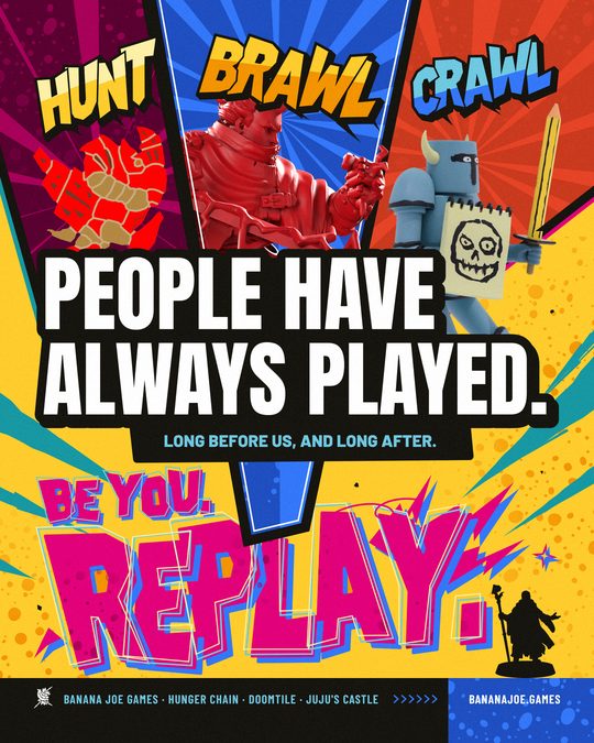
- 25
A real product keeps its own colours. Where a reference shows a product in its own colours on a ground of the same hue, ours keeps the product's printed colours and gives only the ground and the light our colour. On 19 October the DOOMTILE boxes recoloured to black on yellow took two stars: "hai alterato le cromie del prodotto, mentre nell'originale il prodotto era rosso ed è rimasto così".
- 26
A figure in shadow is rim-lit, never cut out flat. Where a reference shows a figure against the light, it keeps a rim of light and some modelling, and its ground has depth and gradients rather than a flat fill. Flat black silhouettes took three and two stars: "non è completamente dark", "lo sfondo qui troppo flat quando l'originale aveva profondità e sfumature".
- 27
A series is held together by its ground and spots, never by stripping a graphic to two colours. When a graphic joins a one-colour series, the series' ground (banana yellow with the orange spots) is the common thread, and the graphic keeps what made it: its lettering colour, its gradients, a black panel that frames it, the accents that carry its subject. On 19 October his Feed 1 picks rebuilt in strict yellow and black took four and five stars with one note: "alcuni elementi importanti delle originali vanno tenuti, non tutto deve essere ridotto a 2 colori"; Kasumi keeps her black panel and pink lettering with yellow only in the star, Joan keeps the gradient on her rows and on the ground.
- 28
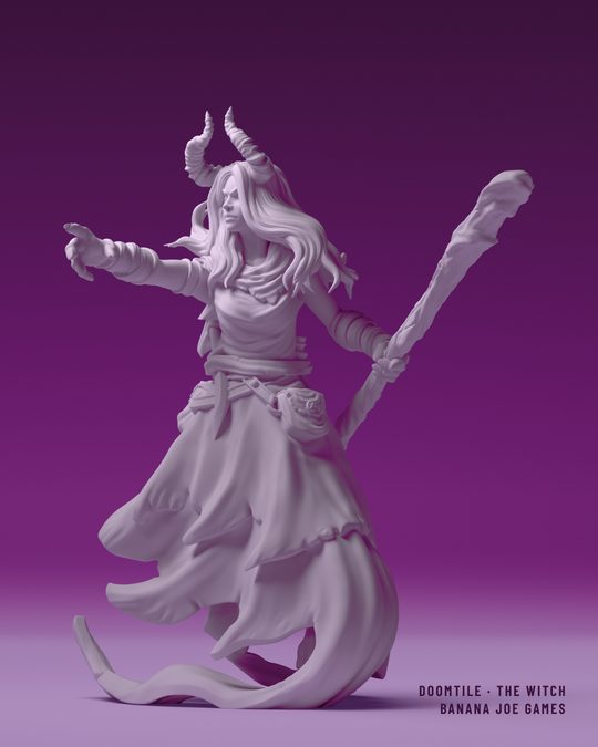
A reference gives the vibe; the subject comes from what we already have. From a reference take its treatment: ground, gradient, grain, type, palette, composition, and rebuild that properly. For its subject, first ask what we already own that resembles it (a fighter, a sculpt, a toy, a render), and use it unchanged. Never alter our art to imitate the reference: on 19 October a MIDNIGHT DREAMS recreation gave the DOOMTILE Witch six drawn ghost arms, and he stopped it: "a me non interessa che sia uguale, quello che conta è il vibe … mettere braccia a un soggetto non va bene perché stai modificando l'illustrazione … devi sempre dire ok cosa ho che posso usare che assomiglia, usiamo questo". Rule 24 still holds for the treatment, which is rebuilt part for part; it no longer means copying the reference's subject.
What the first feed adds
The first feed has rules of its own, written down in the Feed System on 5 October as a reading of his votes on its 36 graphics. His votes cover the pictures, and nothing records that he read the text, so these carry less weight than rules 1 to 28. They hold today in this form:
- A lit object shows a real thing as a solid with a front, a darker side, a lit edge and one soft shadow, and the thing carries print that reads on a phone. A sculpt that reads at once as a character works without print, as r26 showed.
- On a lit object one mass leads. A single object covers a fifth to two fifths of the tile, and several pieces are grouped until they share one outline. On a flat poster the proportions follow the reference instead.
- A first-feed design with no object in it (a type tile, a label, a print) gets depth or a carrier: an extrusion, an overprint, a shadow between layers, or a sleeve, a label, a sticker that the design is printed on.
- Small type is set the way the back of a box is set, as chips that each hold one fact, ruled tables and lines in the corners.
- Lettering is Latin. Another script appears only where a game's own logo carries it.
- A graphic carries one stripe ramp at most. No recreation has used the ramp, so this has not been tested since.
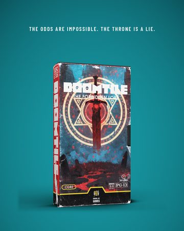
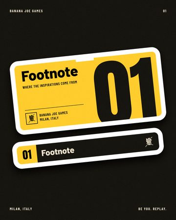
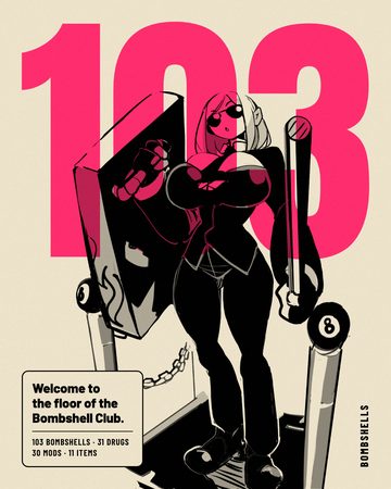
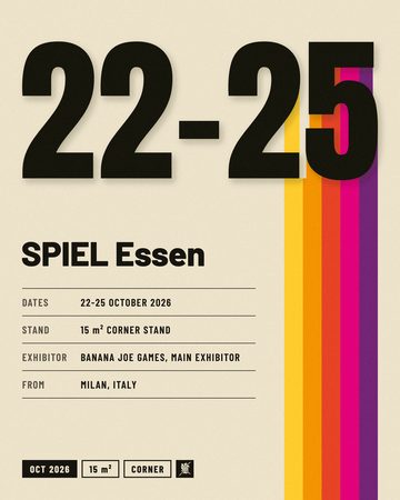
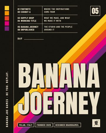
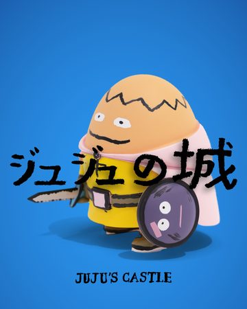
His later votes replaced ten statements of the Feed System, and they fall into three groups. In colour, white on a flat saturated colour is #FFFFFF where cream used to replace it on every graphic tile (rule 18), red is a full ground where it used to be a rare accent (r08, r22, r30), yellow may do every job the reference's yellow does (r21), and a game's colour no longer stays with its game (r13). In lettering and surface, a word may be drawn for the graphic where Anton and a game's wordmark used to be the only title lettering (rule 9), the banana halftone is a standing texture where halftone used to be a three-star finish kept off the grid (r01, r05, r15), and the flecked skin of a worn print, rough-cut letters and a torn edge are in where the reference is made of them (r22, r30, r12). For figures, a cut-out character may stand on a flat colour with a halftone field or a hard shadow behind it (r01, r15), and line-ups and mosaics of many figures are in when the figures overlap into one composition (r02, r11, r14, r19). The masters, last, are Illustrator files, so a new graphic of a first-feed type starts from its Sources folder and never from the Figma file.
What he turns down
He has turned down each of these, and the rule in brackets holds the reason where there is one.
- A graphic blended from several references fails rule 2, and looks sorted by game fail rule 1.
- Phone shots, frames from a reel, work in progress, placeholder art and blank mockups stay out, because pictures built on purpose beat captured ones in his votes, and a blank shell stayed at one or two stars.
- A small word or a logo alone on an empty tile is turned down, and so is a logo used as filler (rule 15). A mark drawn large as the whole picture is another matter and took five stars on r22.
- Frames and ornaments that could belong to anyone fail rule 20.
- Heavy grit fails rule 19: photocopy noise, eroded letters, a halftone that eats its subject.
- A subject in a role it does not suit fails rule 5, and a prop made from another object fails rule 7.
- A dashed rule under a word fails rule 12, and so does anything the frame cuts by accident.
- Among his pins for Bombshell he rejected every card, every pattern and nearly all packaging, and most stickers (13 of 16) and lettering or logo pins (25 of 33). Five-star graphics still came from lettering or logo pins (r22, r23), toys (r26, r28), layouts (r05, r27) and an interface pin (r21), so a new reference is chosen by its stars and never by its group.
4The library
Every layout in the table has a recipe. A recipe is the written card for one layout, and it says what the layout is, which pieces of content it needs, what its subject must be like, how to make a new one, what he said about it and where its files are. On the hub page each id opens its recipe, and the same text is in BJ - BR - ID - Visual Code Recipes.md, which is the file a session searches by id once it has chosen. A recipe that waits for his vote has been checked against its pin by a critic agent and by nobody else.
Layouts already used with more than one subject
These layouts have been built, or asked for, with more than one content. He has voted on more than one version of the first and the fourth only.
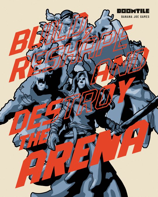
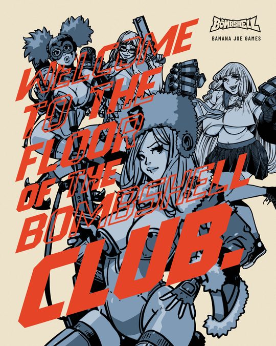
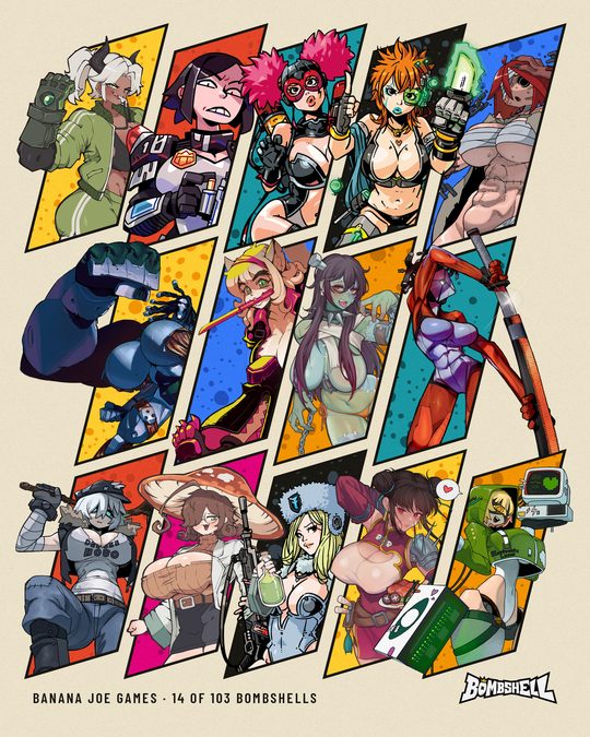
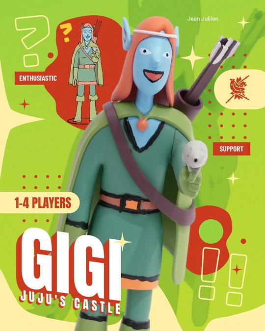
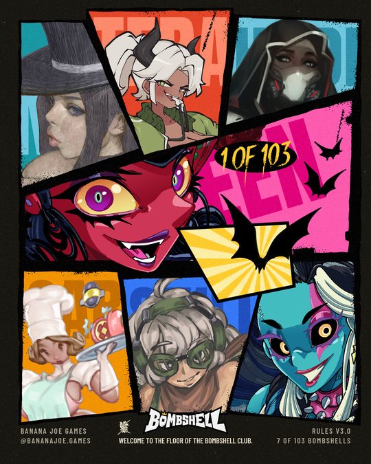
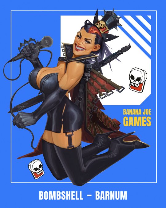
- The line-up crossed by slanted lettering (r14, r14b, r14c) took five stars three times: with DOOMTILE sculpts, with four Bombshells and with four JUJU's Castle toys.
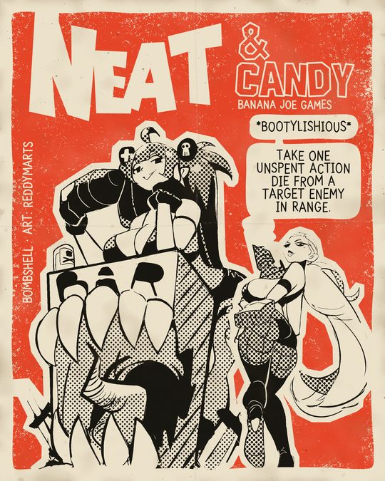
- The two-figure comic page (r30) took five stars in red. Its takes in blue, teal and magenta wait for his vote.
- Front and back on a sweep (r28) took five stars with the Juju toy and waits for his vote with a Bombshell miniature.
- One line across the figure (r06) took five stars with a toy and four and three with two characters whose attitude differed from the pin's. New subjects start from r06b, whose build script takes a subject by name.
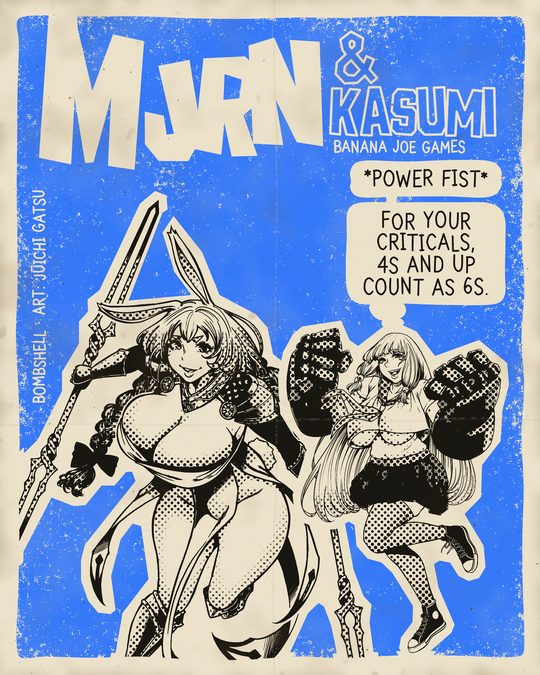
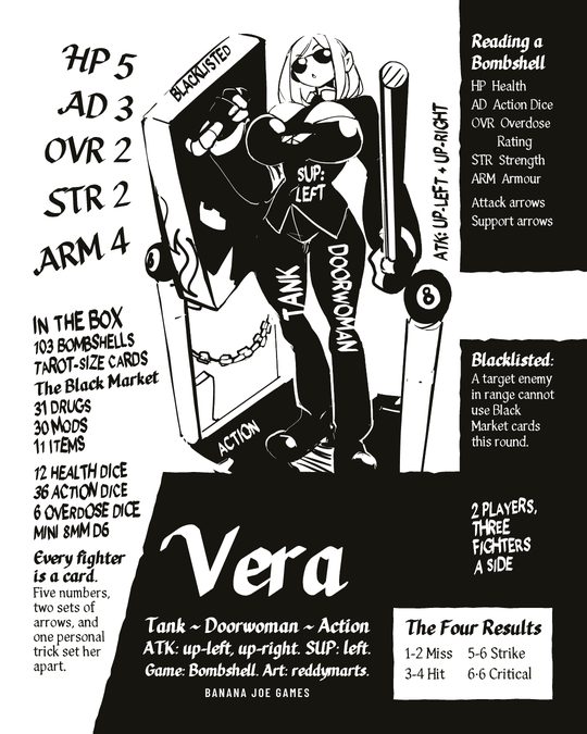
- The hand-lettered character sheet (r12) took five stars with Mjrn. It exists a second time with Vera as r12b, which waits for his vote. It suits fighters whose art is a black and white ink drawing.
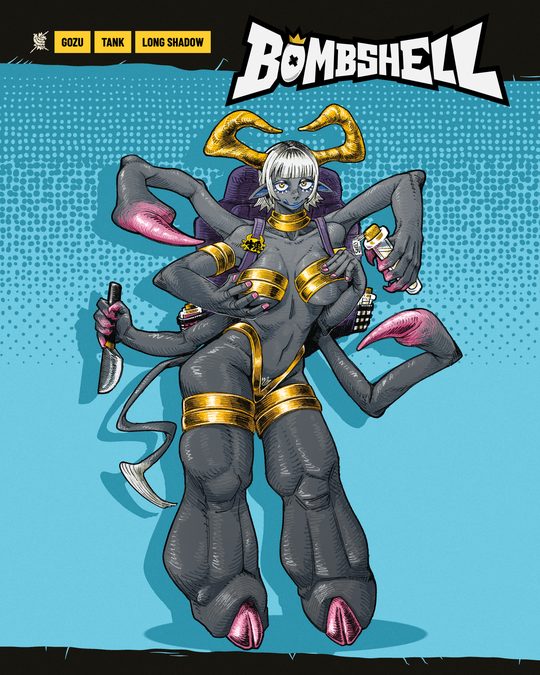
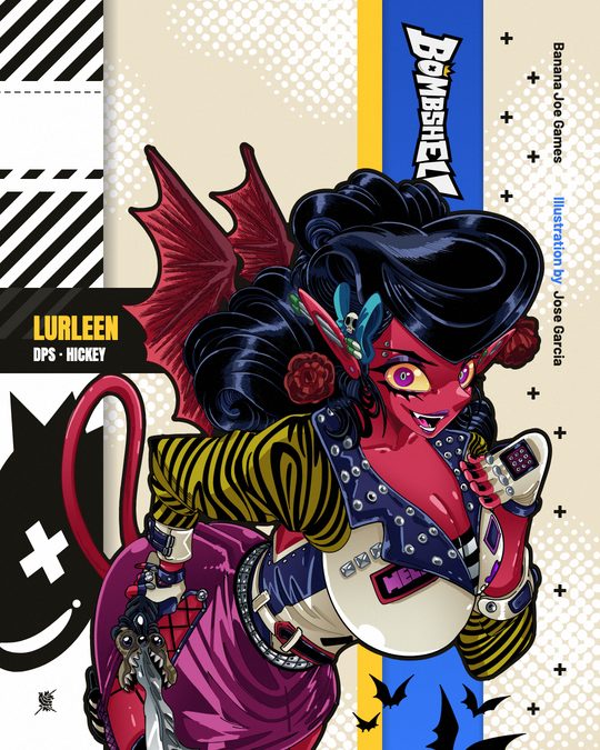
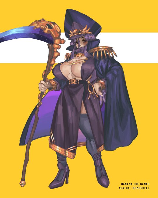
- The character information sheet (r27) is the one he may make the standard page for a Bombshell. It needs colour art, because it takes its accent from the figure.
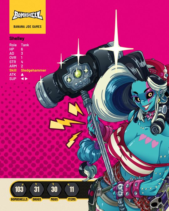
- The brochure page exists for four games on the standard of Andrea's own JUJU's Castle page.
The devices that recur
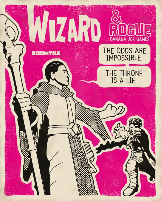
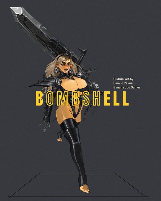
A device is one visual move that returns from layout to layout, such as a cut-out figure, a title across the figure or a halftone block. Each recipe names its devices with the same words, so they can be counted across the library: how many layouts carry a device, how many of those he has voted on and how many of the voted ones took five stars, which tells a session how well tested a device is. The count is on the hub page and at the head of BJ - BR - ID - Visual Code Recipes.md. The best tested today are the cut-out figure, a word drawn for the graphic, a figure printed in one or two inks, several figures gathered into one mass, stacked rows of lettering and the banana halftone.
The fair brochure page
A game page is one full-bleed hero picture that runs into the banana halftone and then into a ground-black band. The band holds the game's own logo in yellow, four facts (a subtitle in yellow Anton, what the game is in one sentence, a two-line statement and a closing sentence), three key words as outlined chips, one figure coming in at the lower right corner and BANANAJOE.GAMES at the foot. A strip at the top holds the studio's icon and name at the left and the game's status as a yellow chip at the right.
The measured standard
Each game page is 844 x 1804 px, built at 1688 x 3608, and all lettering keeps 56 px from the sides. A top strip on baseline y 84 holds the studio icon and BANANA JOE GAMES at the left (Barlow Condensed SemiBold 22 px capitals, tracking 0.12 em, in a colour taken from the hero) and the game's status as a solid yellow chip 40 px tall at the right. The hero is one full-bleed picture from the top edge to y 1084; from about y 701 the banana halftone (the studio's Fade file at 666.7 x 400 px, cell 16.5 px, dots in #17150F) grows downward and merges into a solid ground black band that runs from y 1084 to the foot, and the picture's own blacks are lifted to #17150F under the dots. The game's own logo in banana yellow #FFCD2D spans the margins and ends at y 1143, half on the last dots and half on the band, and a game without a logo gets its name in Anton there. Four facts follow at fixed heights in the band: the subtitle in solid yellow Anton capitals (cap height 57 px, baseline y 1233, about 24 characters), what the game is in one cream sentence in Barlow Medium 33 px (baseline y 1275, the kind of game and whose it is), a two-line statement in Barlow ExtraBold 32 px (baselines y 1489 and y 1529) and a two-line sentence in Barlow Medium 27 px (baselines y 1574 and y 1610). Between the second and third fact a small flat white mark cut from the game's own art stands at the left, about 100 px tall with its foot on y 1440. Three key words follow as outlined cream chips (40 px tall from y 1640, 3 px line, Barlow Condensed Bold 22 px, 12 px apart), each a fact such as the players, the kind of game and one thing that sells it. One figure from the game's art comes in at the lower right corner from about y 1350, cut by the right and bottom edges, BANANAJOE.GAMES closes the page at the left on baseline y 1752, every word comes from the Copy Bank, and a 1.2% grain lies on the flat fields only.
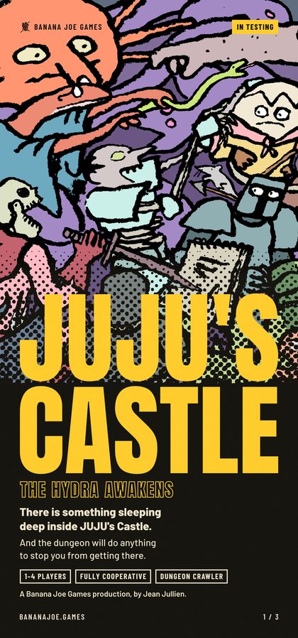 bro-jj-p1 p1 The cover
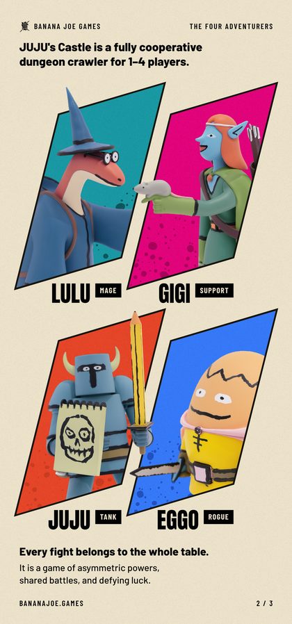 bro-jj-p2 p2 The four adventurers
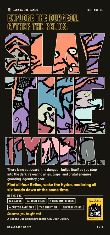 bro-jj-p3 p3 Slay the Hydra
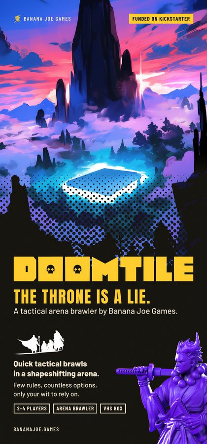 bro-doomtile DOOMTILE
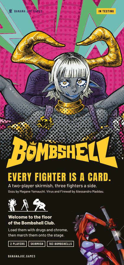 bro-bombshell BOMBSHELL
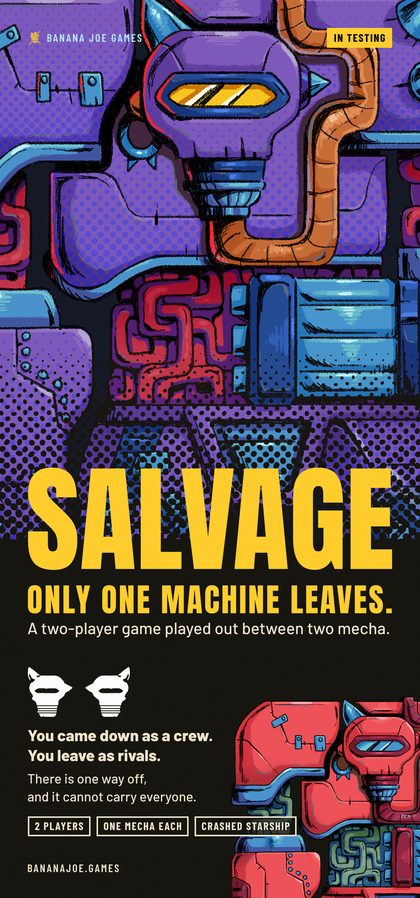 bro-salvage SALVAGE
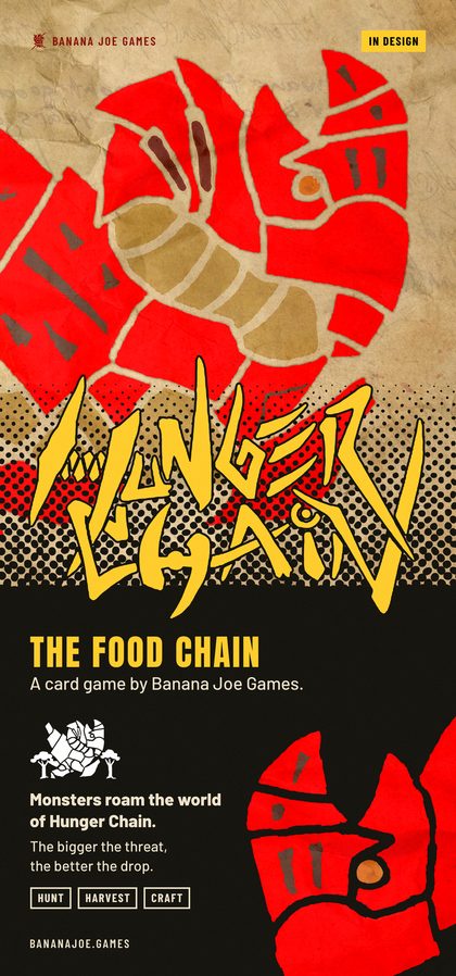 bro-hungerchain Hunger Chain
The first feed
The 36 graphics of 5 October and the twelve pictures of the six question pairs stay part of the language, and they are the reference for lit objects and for measured values such as chip sizes and lit grounds. Their recipes are the sixteen post types of the Feed System and the card-grid picture it takes in beside them, read with the amendments of section 3. Each picture is in …/BJ - MK - Feed Proposal/BJ - MK - FP - Posts/ and its scripts and layers are in …/BJ - MK - FP - Sources/<id>/, which the table calls Sources. How each type is made, with the folder to copy and the script to run, is listed at the end of BJ - BR - ID - Visual Code Recipes.md. Their editable masters are still frames in Figma, and none has an Illustrator master yet.
5Tools and method
Where to work
The Drive keeps the finished things: each picture in _CORE/BJ - Marketing/BJ - MK - Content Creation/BJ - MK - Feed Round 3/BJ - MK - R3 - Posts/, its master in BJ - MK - R3 - Masters/, and its scripts, layers and full description in BJ - MK - R3 - Sources/<id>/. The complete working folders of the recreations, with the render passes and intermediate files that the scripts read, are in ~/Code/bjg-feed-work/round3/<id>/. A new version starts from a copy of that working folder, made outside the Drive. The first feed has no copy in ~/Code, so its Sources/<id>/ folder is copied instead, two levels deep inside the work folder, because some of its scripts also save two folders above themselves.
Three things in the older scripts point outside the Drive and are worth checking before a build: the pins in ~/Downloads/ideox_bombshell and ~/Downloads/ideox_banana-joe-production (copies of the ones used are in BJ - MK - R3 - References/), Anton, and Barlow. A layers folder can hold pieces of an earlier version beside the current ones, so the list in the tile's tile.json is the one to trust. Several scripts end by comparing their output with the picture he voted on. Remove that comparison from your copy of the script before building a new subject, and leave the voted picture where it is.
How a picture is made
| Route | For | Tool |
|---|---|---|
| Layered page | Flat posters: cut-outs, lettering, panels, halftone | The tile's own build.py (Python with Pillow, and headless Chrome where type is photographed) |
| Flat-ink print of a sculpt | The cartoon look of the miniatures on r08, r14, r25, r36 | _CORE/BJ - 3D Files/BJ - 3D - Blender/BJ - 3D - BL - Addons/bjg_ink_print/ (its README has the commands). The look comes from render passes of the 3D model, so it cannot be an Illustrator style. |
| Clay render | One miniature in one hue, as on r26 | Setup Clay in BJG Studio 1.6.0 (…/BJ - 3D - BL - Addons/bjg_studio.py), with the backdrop colour as its one control |
| Lit object, rendered | A box, a cassette, a toy on a lit ground | Setup Studio in the same addon, or a render over a ground from …/BJ - MK - FP - Tools/ground2.py. A DOOMTILE box takes one of the six 2026 sleeve sheets in DOOMTILE/DOOMTILE - Assets/DT - AS - Textures/, since the 2025 sleeve prints an older play time. |
| Mockup fill | A sleeve or a box from the stock VHS mockups, as on a21 | …/BJ - MK - FP - Tools/fill_psd_mockup.py, which fills the mockup file with Photoshop closed |
| Photo cut-out | A toy photographed on white, as on a35 and a24 | The photograph, cut out, over a lit ground |
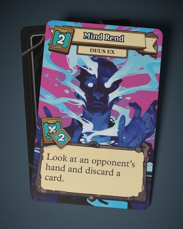
| Card faces | A card shown as an object | The hub's own baked faces. The local copies in ~/.bjg-tools/headless-bake/out/ are older than the hub for many cards, so a face is checked against the card reader, or baked again, before it is used. |
Blender runs in the background for these routes and Andrea's open Blender is never touched. Photoshop and InDesign are never started by a session.
Words and credits
| Source | What it gives | Where |
|---|---|---|
| Copy Bank | Each public game's sentence, tagline, counts, status and credit strings, and what stays out | _CORE/BJ - Marketing/BJ - MK - Content Creation/BJ - MK - Feed Proposal/BJ - MK - FP - Copy Bank.md |
| Card reader | A Bombshell card's name, numbers, skill text and arrows as the hub holds them today. It prints the first 150 characters of a card and no credit, and it has no cards for the other games. | python3 tools/cards.py --game bombshell --find <name>, run in _CORE/BJG - Planner/bjg-hub-site |
| Artists database | The printed credit and the handle to tag | The sheet Bombshell Artists, tab ARTISTS DB |
| The voice | How the studio writes | The skill bjg-brand-identity |
Showing it and reading his vote
A voting page is built with python3 build_feed_page.py feed_page_template.html posts.json <folder of the pictures> out.html --page <page id> --title "…" --intro "…", both files being in …/BJ - MK - FP - Tools/. The reference goes into posts.json as a post of its own before ours, with the kind Reference and a 4:5 picture, and BJ - MK - R3 - posts step 4.json in the Feed Round 3 folder is a worked example. The page is copied into the hub's public/ folder and published with the hub's deploy.sh, which publishes the whole site. For one or two graphics a side-by-side picture in the chat does the same job.
His stars and notes are read back with …/BJ - MK - FP - Tools/export_page_votes.py <page id> <out.json>. His notes are in Italian, and a close translation goes into BJ - MK - R3 - what_andrea_said.md with any new lesson, since that file is the source of section 3. The pages so far are feed-round3, feed-round3-step2, feed-round3-step3 and feed-round3-step4.
The Illustrator master
Since 7 October the editable master of every graphic is an Illustrator file, and the kit, its guide and the runner are in …/BJ - MK - FP - Tools/illustrator/ (GUIDE.md, run_ai.sh). Since he opens and edits each master himself, two rules of that guide decide how it is built: a frame that holds a picture is a real clipping mask round one whole linked picture, and a word that is a window is one live text, which is itself the mask. A third rule covers how Illustrator is driven, which is only through the runner, one script at a time, while he is away from the keyboard, and each script closes only the document it made.
A master is built after his vote and only for what he keeps, because each one costs a run in his Illustrator.
Names and versions
A picture keeps one stable name, BJ - MK - R3 - <id> <title>.png. When it is repaired, the earlier file moves into <name> OLD/<name> v1.png beside it and the new one takes the plain name, so links never break. Masters follow the same rule. A new take of an existing layout takes that layout's id plus a letter, and a new layout takes the next free r number, which is r41.
Keeping the runs small
Each graphic takes one reference, one maker agent that keeps the reference beside its work and one critic agent that scores the result against the reference, and then it goes to his vote. Several runs of fifty to eighty agents each reached the weekly limit on 8 October, so graphics are made in small batches and anything that needs no agent is done by hand.
Keeping this document up to date
Two files are the source of the Visual Code: this file for the prose, and BJ - BR - ID - Visual Code Library.json beside it for the recipes and their votes. The tables between the HTML comments in this file are written from the Library by …/BJ - MK - FP - Tools/build_visual_code.py, so a change to them is made in the Library and never in the table. After each of his votes, the recipe's vote and words are updated in the Library, a new graphic gets a new entry there, and the builder writes the recipes, the elements list, these tables and the hub page again.
6Before a graphic goes public
His stars judge how a graphic looks. Posting it is a second decision, and these points are checked first.
- The caption comes from the graphic's
tile.jsonand follows section 8 of the Feed System: the card's name, then the artist in the exact string the artist chose, in English, with the studio's name in full. - A recreation follows someone else's composition. It is looked at again for how far it stands from its pin, and how far is enough is his to decide.
- A JUJU's Castle graphic waits for his word, because nothing on file says what Jean Jullien has agreed to. That includes his toys printed in one ink (r14c) and two of his drawings joined into one scene (r30c).
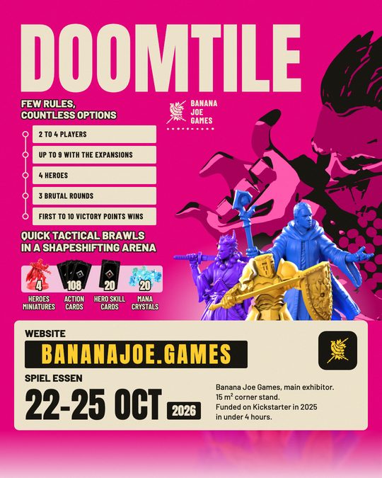
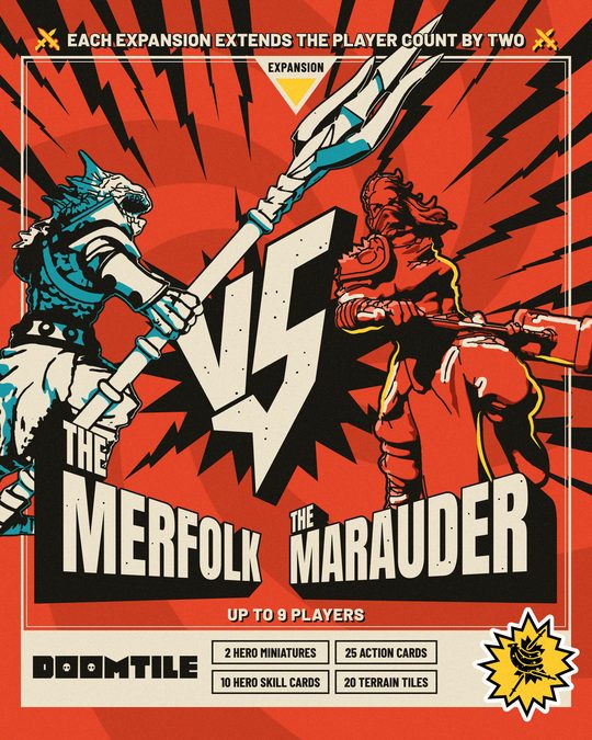
- A DOOMTILE graphic that shows a cover or a sculpt waits for his word. No file names the painter or the sculptor, some cover files point to generative tools, the stock sleeve mockups carry no licence note, and the expansion sculpts have not been shown in public.
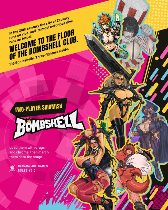
- A Bombshell graphic needs his look at the crop, since the art is pin-up, and a credit that is real: "lysol jones" is a placeholder that stands on thirteen cards, Jinx on r02 among them. 骨ニギー asked to be told before his art goes public (three fighters on r02), and the artists sheet records open payment questions for cptHamburger (Vic on r02) and ICKPOT (Mira on r11).
- SALVAGE and Hunger Chain each need his yes before they are shown, and SALVAGE needs his word on naming Hopes.
- r09, r20 and the first feed's a32 print the dates of SPIEL Essen, 22 to 25 October 2026, and lose their use after the fair.
- This document does not record what has been posted so far, and the Feed System still lists the posting order as open.
7What he has not decided yet
Until he decides one of these, a session follows what sections 2 and 3 say today and asks him when a graphic depends on the answer.
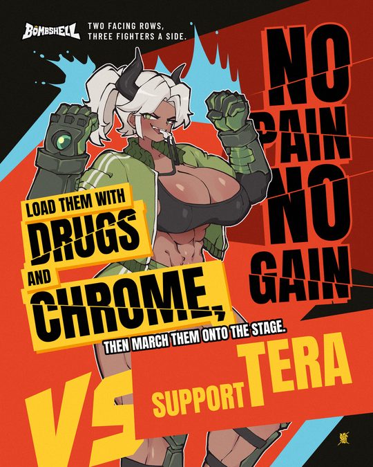
- Step four waits for his vote: three repairs (r16, r25, r29), five versions (r12b, r28b, r30b, r30c, r30d) and ten new layouts (r31 to r40). Until then a page torn open over a face (r37), a figure with nothing behind it but the flat ground (r33, r34), frosted glass panels (r32), hazard strips (r35), a head printed as a sticker (r38), slab lettering in perspective (r39) and a group on a lettered floor (r40) are untested with him.
- The seven brochure pages have no vote, and the fair runs from 22 to 25 October. The three JUJU's Castle pages in the library are the earlier form that he replaced with his own page.
- The values of yellow and black. The logo files use #FFCD2D and #010101, and every recreation that carries yellow or ink black uses those values. The design system for coded pages has #FFCF23 and #17150F. He has not fixed one set, so graphics keep the values of the colour table.
- One red or two. The first feed's accent is #FF3D00 and the recreations' ground is #E64426, which is the one in the colour table.
- The standard sheet for a Bombshell: r27 for colour art, r12 for ink drawings, or the first feed's a02.
- How the two families share one grid. No grid has been laid out that mixes first-feed graphics with recreations, and about two thirds of the recreations are Bombshell posters.
- Capitals or sentence case for a statement. Both have five stars.
- BOMBSHELL or Bombshell in captions, and which variant of the Bombshell wordmark is the official one.
- Where the artist's credit goes, on the graphic or in the caption only, and whether a first-feed object tile gets a studio line when it is rebuilt.
- Whether the Bombshell elements kit serves the whole studio. It was filed as that game's own before he asked for one language.
- Two notes of his that are not carried out. On r08 he gave five stars and wrote that the lettering needs to move down and that he will do it himself in Illustrator. On r25 he wrote "I think it is Dante"; the repair kept the figure as the Monk, and he has not confirmed it.
- Masters still to build: r30d and r31 to r40 after his vote, r06b, r06c and r12b, r02 again with real masks, and the 48 graphics of the first feed, which exist only in Figma. What happens to the Figma files is his to say.
- About thirty four-star pins wait for later steps. A new layout takes one of them and follows it as rules 2 to 4 say.
- The first feed's own open list, in section 10 of the Feed System: DOOMTILE's play time, the older miniatures on a27, a31 and a36, and whether a logo-only tile and interface marks belong.
- File names that describe an earlier version: r07 still says "the studio's mark", r08 still has the ampersand and r29 still says "a paper arch".
8The elements
The ready-made pieces a graphic can reach for are listed in BJ - BR - ID - Visual Code Elements.md beside this file, each with what it is, when to use it, its limits and the place of its master and of its exports. The same file holds two tables: which letters exist in each drawn alphabet, and what material each game has, with the list of its files and what Andrea approves before a graphic of that game is public. Pieces that belong to one layout, such as a drawn word or a housing, are listed on that layout's recipe under "Pieces worth using again".
Drawn alphabets
Lettering drawn for a graphic exists only for the letters its own words needed, so a new word costs as many new letters as this table lacks. Each alphabet lives in a script of its tile's sources folder.
| Manner | Where | Letters that exist |
|---|---|---|
| Slanted block capitals, solid and outlined | r14, r14b, r14c (drawn.py, three files to merge) | A B D E H I L N O P R S T U Y and the comma in all three; C and the full stop in r14b and r14c; F M W in r14b only; G X in r14c only |
| Comic capitals | r18 | A B C H L N R T U W |
| Graffiti blocks | r18 | A B E L O P R U Y, full stop |
| Brush capitals | r20 | A E H I L N O R S T, full stop |
| Dry-brush capitals | r11 (scrawl.py) | O F, the digits 1 0 3 |
| Slab capitals on black slabs | r23 | N O D R A W, exclamation mark |
| Block capitals, sticker letters, tube letters | r24 | C R I T A L; E S M R H Y T; H I T |
| Graffiti tag | r27, r32 (drawn.py) | M O T H E R; O S I T A |
| Paper-cut capitals | r30, r30b, r30c, r30d (hand.py) | N E A T M J R H W O U S I Z D, apostrophe |
| Outlined comic capitals | r30 family (hand.py) | C A N D Y K S U M I T L E R O G |
| Pen lettering for balloons | r30 family (hand.py) | The alphabet without Q, the digits 4 and 6 |
| A drawn VS | r08, and a wider one on r21 (drawn.py) | V S |
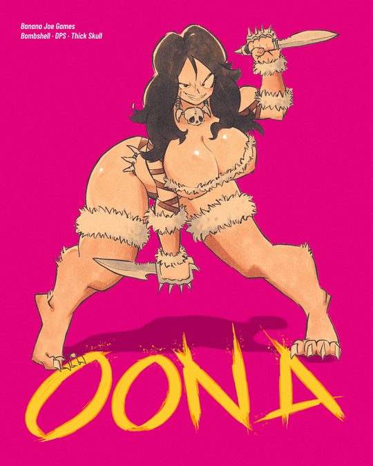
| Brushed name | r33 | O N A |
| A whole page lettered by hand | r12, r12b | The words of Mjrn's and Vera's sheets |
Each game's material
| Game | What exists | The list of its files | What Andrea approves before a graphic is public |
|---|---|---|---|
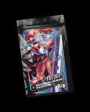
| Bombshell | Fighter illustrations by some thirty artists, most as large cut-outs; the wordmark; the elements kit; baked card faces; one miniature as a 3D model. Already on first-feed tiles: Firewall a02, Bertha a09, Virus a15, Vera a20, Thera a30, Frejus a34. | _CORE/BJ - Marketing/BJ - MK - Content Creation/BJ - MK - Feed Round 2/BJ - MK - R2 - Boards/Bombshell/BS assets.md | The art is pin-up, so Andrea approves each crop. Credits are the exact strings of the Copy Bank and the hub. |
| JUJU's Castle | About 65 studio photographs of Jean Jullien's toys, his wordmark and drawings, the brawl illustration, four miniatures in 3D | _CORE/BJ - Marketing/BJ - MK - Content Creation/BJ - MK - Feed Proposal/BJ - MK - FP - Tools/assets-juju.md | Nothing on file says what Jean Jullien has agreed to, so Andrea approves each graphic. |
| DOOMTILE | The finished game: logotype and skull, six 2026 sleeve sheets, renders, cover paintings, card faces, the sculpts of ten heroes. A request for "the box" needs the sleeve named. | …/BJ - MK - FP - Tools/assets-doomtile.md | No file names the painter or the sculptor, and the expansion sculpts have not been shown in public, so Andrea approves each graphic that shows a cover or a sculpt. |
| SALVAGE | One finished illustration of a mecha and sketches of the bots. It has no logo. | …/BJ - MK - FP - Tools/assets-othergames.md | No illustrator is named, so Andrea approves each graphic. |
| Hunger Chain | The Hunt Quest poster, three dossier pages, a small logo | …/BJ - MK - FP - Tools/assets-othergames.md | The game is in design, so Andrea approves each graphic. |
| The studio | The logo set, the logo elements, ten sticker faces | …/BJ - MK - FP - Tools/assets-core-brand.md |
These lists are surveys of 4 and 5 October. Their contact sheets were not saved, and where a list disagrees with this document, this document is newer. Gaki Race, Sound of Violence, Takeover, Memento Mori, CHESS PROJECT and Pieces of Night stay out of every public graphic, for the reasons the Copy Bank gives.
Gaki Race, Sound of Violence, Takeover, Memento Mori, CHESS PROJECT and Pieces of Night stay out of every public graphic, for the reasons the Copy Bank gives.
9The documents around this one
BJ - MK - R3 - what_andrea_said.mdholds his words on every step and is the source of the rules. He is quoted only from it.- The Feed System (
BJ - MK - FP - Feed System.md, on the hub as Feed System) holds the first feed's measured values, its sixteen post types and the card grid. It is read with the amendments of section 3. - The Brand Identity Guide and the Logo Elements Brandbook in
_CORE/BJ - Branding/BJ - BR - Identity/describe the logo and its elements. - The design system in
_CORE/BJ - Branding/BJ - BR - Design System/serves coded pages, pitches and slides, and it is a separate thing from this code. - The skill
bjg-brand-identitygoverns the words on a graphic, and this document governs its picture.